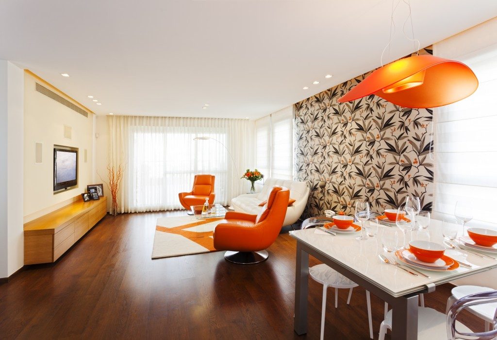
The interesting thing about people’s aesthetic preferences is that it’s never set on one particular ‘taste’ alone. Some homeowners like a classic design for all its sophistication and elegance, at the same time, admire industrial style because of its ruggedness and rawness. Sometimes, you wish you could have different aesthetics in one space, but then again, you don’t want to risk your room looking like it’s a jumble of designs, right? Here’s the thing: you can mesh different interior design styles and still pull off a clean and visually appealing home. The secret? In these steps:
Highlight the common denominator.
The key to achieving a seamless look when you’re pulling together different designs is to spot their similarities and emphasise them. For instance, in the example above, classic and industrial design both feature wood accents. In classic, you can see natural wood in different areas: in walls as panels, in flooring with geometric patterns, known as parquet, and in furniture, accentuated by upholstery. In industrial design, you notice it more in the structure of the home, like the ceiling beams, staircase designs, or room dividers, often in weathered, unfinished look, furnished with steel. You don’t need to reflect all these details in the space. Touches of wood elements replicated in the space will create that sense of unity and harmony already. The principle is, look for the common elements in the design styles you’re merging.
Take note of the division.

It looks like the best approach for meshing different styles is to have an equal distribution of the designs in the elements in the room. You’re going for the balance, of course. This is a good strategy, but one that’s hard to pull off. In the first place, it’s difficult to determine if you achieved already an ‘equal’ division. So instead of doing that, the best approach is to go for an off-balanced look. Think 80-20 distribution. The style that you prefer will cover 80% of the space, which means it will influence your choices for colour palette, wall and flooring materials, and furniture. The remaining 20%, the accents in the room, like the artwork, statement pieces of furniture, and lighting will be dedicated to the other design style you like. It will also include the embellishments you’ll add in fixed structures at home, say, the carpets on the floor, draperies and curtains on windows, or runners on the stairs.
Emphasise character pieces.
It’s inevitable to have elements that don’t look fitting in your blended design. Like, for example, that elegant dangling chandelier, a defining component of a classic design, but looks off-putting when you put it in the middle of a classic-industrial style. Your first thought might be just to put it away. Don’t. Even though it looks out of place, it will work perfectly as long as you treat them as the focal point. So if it’s a piece of lighting fixture that you want to emphasise, draw the eyes upward, say, by adding colour overhead or using tall plants placed against the walls. If it’s statement furniture, re-orient and re-arrange the other furniture towards that character piece.
Mixes of Different Styles
Again, it’s possible to have different interior design styles in one space — as long as you observe the principle of unity, proportion, and emphasis. Now, go re-decorate your space and get the best of both or (more) worlds.

